
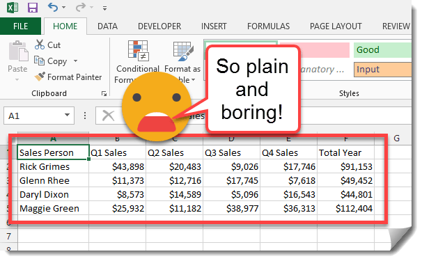
So you’ve just finished compiling the sales figures for the big boss man and you’re ready to send it off to him, but wait there’s something missing! It’s so plain and boring. It needs some style and some visualization of what the data means. People are visual by nature so that report you spent ages compiling isn’t going to get the full attention of someone if it doesn’t also look good. In this post we’ll show you how to quickly add table styles, in cell data bars and spark lines to really make your data speak to someone.
Step 1: Add a table style.
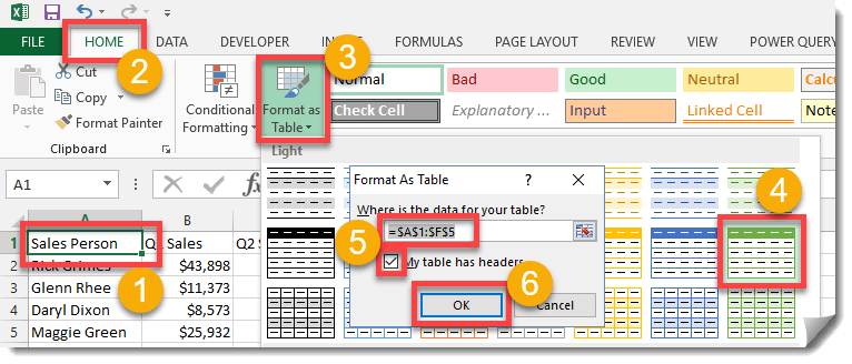
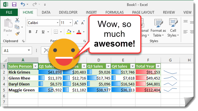
Adding a table style is a quick and easy way to make your data stand out.
- Click on any cell in your data.
- Go to the Home tab in the ribbon.
- Select Format as Table from the Styles section.
- Select a style you like.
- Make sure the range selection covers all your data and if your data has column headings make sure the My table has headers is checked.
- Press the OK button.
Like magic, your table is perfectly styled and already much more appealing.
Step 2: Add visualization to your data with in cell data bars.
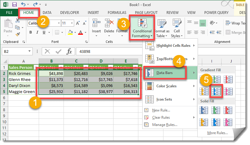
Now that the table is styled, let’s add some visualization. No one like looking at numbers when can see a picture instead.
- Highlight all the quarterly sales data. Leave out the totals for now as this will skew the bars for the quarter’s.
- Go to the Home tab.
- In the Styles section press the Conditional Formatting icon.
- In the drop down menu go to Data Bars.
- Select a style you like.
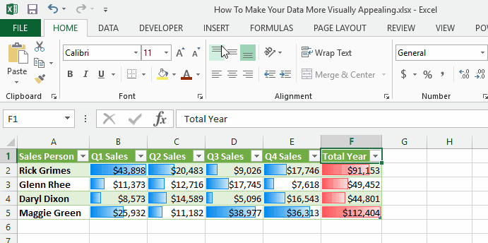
Repeat the above steps while this time only highlighting the Totals. Select a different Fill Style for the Totals to differentiate. Now you can easily see at a glance who has the most sales and in what quarter.
Step 3: Add spark line graphs.
To add an extra special touch let’s add some spark line graphs.
- Go to the Insert tab.
- From the Sparklines section press the Line button.
- In the Choose the data you want section select the first set of sales data.
- In the Choose where you want the sparkline to be placed section select a cell to the right of the first sales person.
- Copy down the cell by dragging from the lower right corner of the cell cursor.


MANY THANKS
No problem, I’m glad these tutorials are helpful!