Adding symbols into your tables or charts can be a great visual aid to your numbers. In this example we’ll look at how we can add up and down arrows into our number formatting to show increases or decreases in our data. The symbols we’re going to use are unicode characters which are actually a standard across any platform and are available on any language PC.
Step 1: Accessing Symbols in Excel
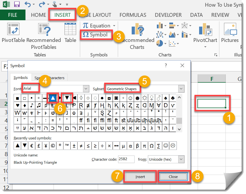
We’ll need to insert the symbols we want to use into our workbook.
- Select an empty cell to insert the symbols into.
- Go to the Insert tab in the ribbon.
- From the Symbols section, press the Symbol button.
- Select Arial from the Font drop down list.
- Select Geometric Shapes from the Subset drop down list.
- Select the ▲ arrow.
- Press the Insert button. Select the ▼ arrow, and press the Insert button again.
- Press the Close button.
You can now use these symbols later by copying and pasting them from the cell you inserted them into.
Step 2: Adding Symbols To Your Table Formatting
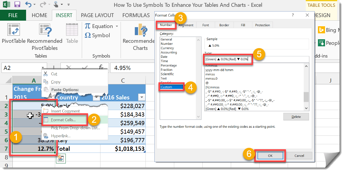
We can add symbols into our table data using cell formatting.
- Select the data from your table where you want add symbols.
- Right click and select Format Cells from the menu. You can also access the Format Cells menu using the Ctrl + 1 keyboard shortcut.
- Go to the Number tab in the Format Cells menu.
- Select Custom from the Category.
- Add this format code to the Type. or modify it with different symbols you might have chosen in step 1.
[Green] ▲ 0.0%;[Red] ▼ 0.0%This will format positive numbers as green with a up arrow in front and negative numbers as red with a down arrow in front.
- Press the OK button.
Step 3: Add A Bar Chart Using Your Data
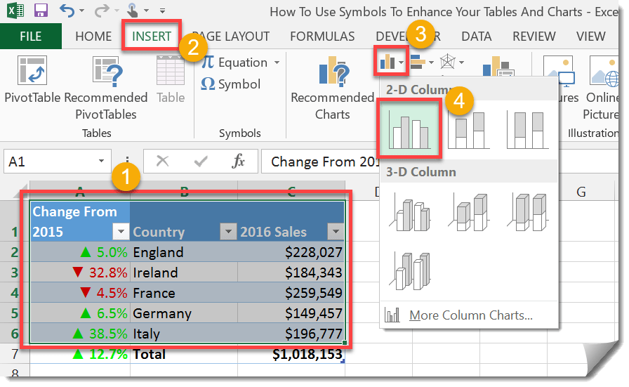
Charts will automatically take on the formatting of the data used so our chart will also have a nice visual appeal.
- Select your data.
- Go to the Insert tab in the ribbon.
- From the Charts section, press the small Bar Chart icon.
- Select the 2D Bar Chart from the menu.
If your bar chart doesn’t contain the symbols then you can add them in.
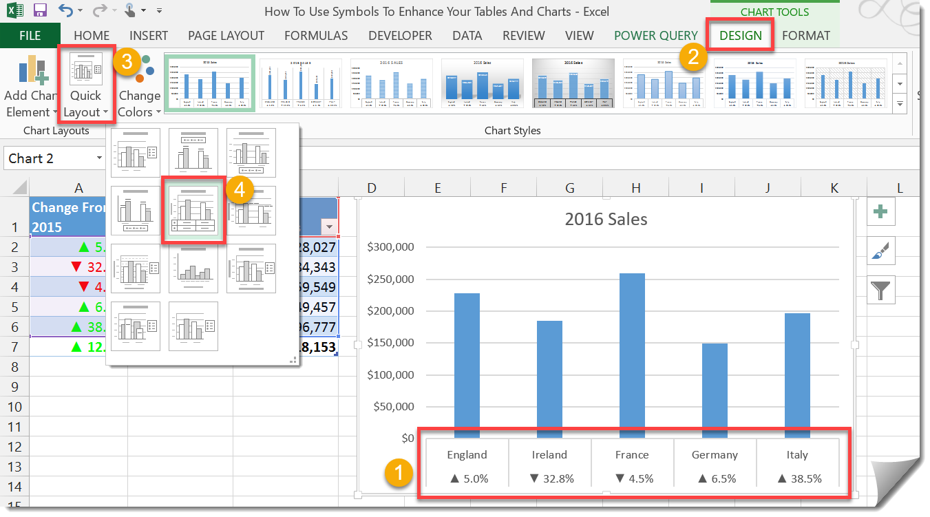
- Here we can see the symbol formatting in our chart. If it’s not already there, click on the chart.
- Go to the Design tab.
- From the Chart Layouts section, select the Quick Layout button.
- Select your preferred layout.
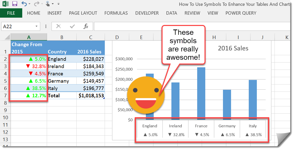
Now you have a cool graph with easy to see information about the change in sales since last year. The formatting is dynamic so if you update your data the symbols in the table and graph will update accordingly.


0 Comments