Are you tired of your charts lacking clear and informative axis titles? Well, worry no more, because I’m here to explain how to add axis labels in Excel for charts and graphs.
Adding a chart axis title in Excel shouldn’t be a challenge because Excel generates the primary chart title automatically. The problem arises when you’re editing charts and graphs created by someone else who might have deleted the axis label. Also, due to any temporary software bug, Excel may not create any chart title or axis label at all.
Keep reading this ultimate rundown of beginner to expert-level methods to insert chart and axis labels in Excel to make your charts and graphs easily readable.
What Are Axis Labels in Excel?
Axis labels in Excel refer to the descriptive text displayed along the axes of a chart. Axis titles provide crucial information about the data you plot on a chart or graph. Thus, helping you to clarify what each axis represents.
You should typically use axis titles to label the horizontal (X) and vertical (Y) axes, indicating the categories or values you’re measuring. By adding axis labels, you can make your charts more understandable and meaningful, enabling viewers to interpret the data accurately.
There are two types of chart labels you can use in Excel and these are as outlined below:
- Chart Title with Above Chart and Centered Overlay positioning
- Axis Titles with options for Primary Horizontal (Y-axes) and Primary Vertical (X-axes)
You can easily find the above options within the Chart Design tab on the Excel ribbon or by clicking the Chart Elements icon on the chart or graph you created.
Reasons to Add Axis Labels in Charts in Excel
- Provide clear identification of the data represented on each axis
- Help viewers understand the categories or values being measured
- Axis labels add context and meaning to the chart, making it easier to interpret
- To enhance the overall clarity and professionalism of the chart
- Axis labels make it easier to communicate data effectively to an audience
- To improve the visual presentation and aesthetics of the chart
- Chart axis titles provide a reference point for analyzing and comparing data accurately
- On internet publishing, axis labels increase the accessibility features of the charts since screen reader apps can read it to the differently-abled readership
Add Chart Axis Title Using the Default Label
By default, Excel should populate the chart title. Follow these steps to edit it:

- Highlight the Chart Title text by clicking once.
- Now, double-click to bring up the typing cursor or to select the Chart text.

- Hit Ctrl + A to select the Chart Title text and press Delete to get rid of this.

- Type your own chart label.
- Click anywhere else other than the chart to save the changes.
Add Axis Label From Chart Elements on the Graph
When there are no chart labels or axis titles, here’s how you can add those from the Chart Elements option of any chart on Excel:

- Highlight the chart by clicking it once and three buttons will show up in the top right corner of the chart border.
- Click the plus icon (+) or the Chart Elements button.
- On the overflow menu, checkmark the checkbox for the Chart Title item.
- You can also click the arrow at the right side of the Chart Title to find positioning options like Above Chart and Centered Overlay. Click any to get your chart title.

- Again click the Chart Elements option and checkmark the checkbox for Axis Titles.
- Both horizontal and vertical axis titles will show up on the graph.
- Click the arrow on the Axis title option to choose either the Primary Horizontal or Primary Vertical axis titles or both.
Now, follow the steps mentioned previously to modify the text of the chart and axis titles.
Add Axis Titles in Excel From Chart Design Tab
If your Excel app version doesn’t show the Chart Elements button on the chart, you can use the Chart Design tab instead. Find below the step-by-step instruction:

- Click the chart on your worksheet and select the Chart Design tab on the Excel ribbon.
- Select Add Chart Element inside the Chart Layout block.
- On the context menu that pops up, you should see Axis Titles and Chart Title.
- Hover the cursor over the Chart Title element to find additional options like Above Chart and Centered Overlay.
- Click any of these to get a text placeholder for the graph label.
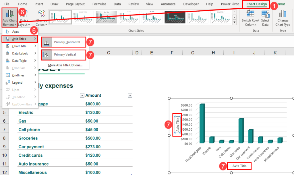
- Hit Add Chart Element button again and hover the cursor over Axis Titles to expand the overflow menu.
- There, click Primary Horizontal and Primary Vertical to get both Y-axis and X-axis titles on your chart.
You can now double-click these text placeholders on your graph to personalize the chart and axis labels.
On dated Excel desktop apps (Excel 2007, 2010, etc.), you’ll not find the Chat Design tab. Instead, you’ll see the Chat Tools tab upon clicking the chart or graph on your worksheet. Inside Chart Tools, click Layout and select the Chart Title and Axis Titles buttons inside the Labels commands block on the Excel ribbon to add the respective chart labels.
How to Add Axis Labels in Excel Using the Quick Layout Tool
This is another intuitive way to add chart titles and axis labels in a few clicks. Try these steps:

- Highlight your chart and click Chart Design on the Excel ribbon.
- Click the Quick Layout drop-down list inside the Chart Layouts block.
- Choose Layout 7 on the context menu to add both axis labels in Excel.
- Select Layout 8 to insert chart, horizontal, and vertical axis titles.
- Customize the title text placeholders according to your requirements.
Add Chart Axis Title Using the Formula Bar
Do you need to change the chart label, X-axes title (vertical title), and Y-axes label (horizontal title) dynamically as the Excel dataset or table changes? You can utilize the Excel Formula Bar to achieve this. Here are the steps you should follow:

- Use any of the above-mentioned methods to populate the chart title, horizontal title, and vertical title.
- Now, highlight one title text by clicking on it.
- Then, click the Formula Bar and type an equal sign (=).
- Use the mouse cursor to select any of the cells within the worksheet that contains an alphanumeric string, like a text or number.

- Hit the
Enterkey and Excel will update the selected title with the content of the linked cell. - Repeat the above steps for all other titles within the chart or graph.
Chart labels or axis titles modified this way will dynamically change the text when you change the content of the referenced cell through the Formula Bar.
How to Add Axis Labels in Excel Using A VBA Script
Working on an Excel VBA project to automate the data visualization process? You can use the VBA code below to add axis labels automatically to your charts and graphs. Find below the code and how to implement it in Excel:

- On your worksheet, click the Developer tab and select Visual Basic inside the Code commands block.

- Now, on the VBA Editor tool, click Insert and select Module.
- Into the blank module, copy and paste the following VBA script:
Sub AddAxisTitles()
    Dim chartObj As ChartObject
    Dim chart As chart

    ' Loop through each chart object on the worksheet
    For Each chartObj In ActiveSheet.ChartObjects
        ' Set a reference to the chart
        Set chart = chartObj.chart

        ' Set the X axis title
        chart.HasTitle = True
        chart.ChartTitle.Text = "X-Axis Title"

        ' Set the Y axis title
        chart.Axes(xlValue).HasTitle = True
        chart.Axes(xlValue).AxisTitle.Text = "Y-Axis Title"

        ' Exit the loop after the first chart is processed
        Exit For
    Next chartObj
End Sub
- Click the Save button and close the VBA Editor interface.

- Now, hit Alt + F8 to open the Macro dialog box.
- There, select the AddAxisTitles macro and hit the Run button to run the VBA macro.
- You should see X-Axis Title and Y-Axis Title placeholders on your chart.
In the above VBA script, enter the exact title text in place of the “X-Axis Title” and “Y-Axis Title” code elements. Thus, you won’t have to modify the axis titles on your graph manually.
How to Add Axis Labels in Excel Using Office Scripts
If you need to automate the chart title and axis title creation process in Excel for the web, you must use Office Scripts because Excel VBA doesn’t work there. Also, Office Scripts is available in Excel for Microsoft 365 desktop app which is more advanced than Excel VBA. Furthermore, Office Scripts is easier to code than Excel VBA. Find below the code and steps to automate the process:

- Open the Excel worksheet where you got the chart that needs axis and chart titles.
- Click the Automate tab and select New Script.

- Now, copy and paste the following Office Scripts code into the Code Editor:
function main(workbook: ExcelScript.Workbook) {
	let selectedSheet = workbook.getActiveWorksheet();
	let chart_4 = selectedSheet.getChart("Chart 4");
	// Change title overlay for chart chart_4
	chart_4.getTitle().setOverlay(false);
	// Change title position for chart chart_4
	chart_4.getTitle().setPosition(ExcelScript.ChartTitlePosition.top);
	// Change axis orientation to horizontal for chart chart_4
	chart_4.getAxes().getCategoryAxis().getTitle().setTextOrientation(0);
	// Change axis orientation to vertical for chart chart_4
	chart_4.getAxes().getValueAxis().getTitle().setTextOrientation(180);
}- In the above code, replace the
"Chart 4"andchart_4with the chart name or index of the chart in your own Excel worksheet. - Click Save script by giving it a name so you can identify it later easily in the All Scripts panel.
- Now, hit Run to execute the Office Scripts code and add axis and chart titles in your graph.
Conclusions
Now you know how to add axis labels in Excel using easy methods like the Chart Elements, Chart Design, and Quick Layout tool. You’ve also learned an expert way to add axis titles using the Formula Bar in Excel. Finally, you’ve discovered options to automate this task using Excel VBA and Office Scripts.
Try out the methods and share your experience in the comment section. Also, comment if you know any other intuitive and smart ways to add a chart axis title in Excel.


 👉 Find out more about our Advanced Formulas course!


0 Comments