Learn how to add a trendline in Excel in this quick and simple Microsoft Excel tutorial.
Microsoft Excel brings you various types of charts to visualize data effectively. However, to make such visualizations easily readable, you might often need to add a trendline. This chart element makes data trends easily visible, shows a forecast of activities based on the present dataset, and identifies anomalies in the collected data.
In this article, I’ll show you different methods to add trendlines and customize those with numbered steps and real images. Furthermore, I’ll show complex scenarios to add Excel trendlines. Finally, I’ll also present to you programmatic approaches to create trendlines in Excel.
Trendline in Excel Using the Chart Design Tool
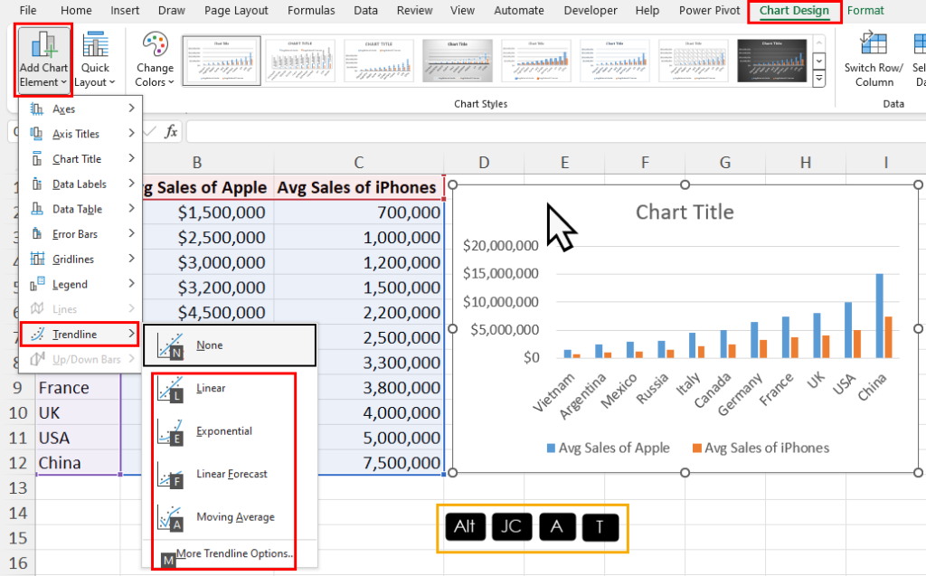
Go to your Excel chart on the worksheet and click anywhere on it to activate the Chart Design tab on the Excel ribbon.
Now, press Alt + JC + A + T to bring up the Trendline menu.
You now need to press any of the following keys depending on which trendline types you want to add:
Lfor LinearEfor ExponentialFfor Linear ForecastAfor Moving AverageMfor More Trendline Options

If there’s only one data series in your chart, Excel shall instantly add the trendline to the graph.

However, Excel shall show the Add Trendline prompt so you can choose which data series you’d like to create the trendline for. Select the option and click OK to apply.
📒 Read More: 8 Best Ways To Make a Pie Chart in Microsoft Excel
Trendline in Excel Using the Chart Elements Tool

Click on your Excel chart to find the Chart Elements tool. It’s a plus icon in the top right corner of the chart box.
Bring up the Chart Elements menu by clicking on the plus icon.
Hover the mouse cursor over the Trendline item of this menu. Another arrow will show up. Click on it to find a list of trendlines you can add.

Now, choose the trendline you want from the overflow menu.
Excel shall add the trendline.
📒 Read More: 3 Ways to Make a Histogram in Microsoft Excel
Trendline in Excel Using the Right-Click Menu
You can also quickly add a trendline to your chart by selecting a data series and right-clicking on it.

Click on a column or the line of your chart.
Excel shall highlight the relevant data series in the input dataset.

Now, right-click on the selected data series. You’ll see the Add Trendline option in the right-click context menu.
Click on the Add Trendline option.

The Format Trendline dialog shall show up on the right side.
In the right-side navigation panel, you’ll see the Trendline Options.
You can now choose from six different types of Excel trendlines, like Exponential, Linear, Logarithmic, Polynomial, Power, and Moving Average.
Excel
Multiple Trendlines in Excel
You can add a trendline for each data series in your Excek chart. However, you must follow a secret trick that I’m showing below to easily add multiple trendlines.

First, add the trendline for one data series using any of the previously explained methods. For example, you can use the Chart Element tool to add a trendline.
Choose the first data series to which you wish to add the trendline from the Add Trendline dialog.

Now, if you click on the Trendline element again, Excel shall delete the newly added trendline.
Instead, you must click on the Trendline arrow in the Chart Elements dialog to bring up the list of trendlines.
Click any of the trendline styles to show the Add Trendline dialog again.

You can now choose the second data series in the dialog box to add the second trendline.

Excel shall insert the trendline in your chart.
Creating Different Trendlines for One Data Series

Add the first trendline using any of the above methods. Suppose, you can add a Linear trendline using the Chart Elements tool on the graph.

Now, open the Trendline menu again and choose a different trendline type, like Exponential.

Repeat the step again for the third trendline, like the Two Period Moving Average.
Extending Trendlines in Excel
You can use the pattern of your data series to extend the trendline forward or backward. By doing so, you’ll create a forecast of performance, sales, population, revenue, etc., data you’re plotting on an Excel chart. This is a smart and easy way to forecast future values based on the existing dataset’s trend.

I hope that you’re trying this method on a chart where you’ve already added a trendline.
Double-click on the trendline that you wish to extend upwards or downwards.
The Format Trendline sidebar shall open on the right side.
On the sidebar, find the Forecast section. There, you shall see two options: Forward and Backward.
Here’s how to use these two options:

- Forward: It typically refers to the number of future data points or periods for which you want to extend the trendline. Suppose, you’re plotting sales figures of your business for the first 6 months of the year. Now, you can see projected sales for the rest of the 6 months by entering 6 in the Forward field. The unit is Periods. In the current chart, one month is one period.
- Backward: It works just as opposed to the Forward field. You can estimate the past values based on the current dataset, that are not in your chart.
In the current exercise, I’ve shown the usage of Forward Forecast in Excel trendlines.
You can make a visual guess of the forecasted values by looking at the graph itself.
However, if you need the exact values, you can back-calculate them from the trendline equation.

Double-click on the trendline again to show the Format Trendline sidebar.
There, checkmark the checkbox for Display Equation on chart checkbox.
Now, you can use the following Excel functions to get the predicted future values:
- FORECAST for a linear trendline.
- LINEST & GROWTH for more complex trendline equations, like exponential or polynomial.
Formatting Trendlines in Excel
You can customize the look of the trendline in many ways to make the trendline easily readable, informative, and professional.
To activate the formatting interface for any Excel trendline, double-click on it. You’ll see the Format Trendline sidebar on the right-hand side.
There, you can customize the following attributes of the trendline. I’ve also mentioned the parent menu where you’ll find the options listed below.

- Fill & Line:
- Line option enables you to change the dashed trendline (Automatic) to any other style like Gradient, Solid, etc.
- Color lets you choose a different shade for the trendline.
- If you wish to thicken the trendline use a higher value in the Width field.
- The default trendline is a straight line. If you wish to add an arrow, choose an option from the Begin Arrow type drop-down menu.
- If you want arrows at both ends of the trendline, choose a similar arrow style for the End Arrow type field too.

- Effects: It mainly allows you to make the trendline data visually appealing. Find below the options you can customize:
- Shadow: This includes color, transparency, size, blur, angle, and distance.
- Glow: It consists of sub-features like color, size, and transparency.
- Soft Edges: You can increase or decrease the values in the Size field.
- Presets: All the above options come with a few pre-configured custom styles you can choose from.

- Trendline Options: You’ll primarily use this customization menu to modify your trendlines in technical terms. It has the following sub-features:
- Trendline Types: You’ll see 6 different options, like Exponential, Linear, etc.
- Trendline Name: If you choose Automatic, Excel shall automatically create a trendline title for you. To customize it, click the Custom field and enter the title you want to create.
- Forecast: You’ve already learned about it in the previous section.
- Checkboxes: These are straightforward selections like Set Intercept, Display Equation on chart, and Display R-squared value on chart.
Choosing the Right Excel Trendlines
Find below simple descriptions of different trendlines in Excel so you can choose the appropriate ones depending on the scenario and dataset:
- Exponential: It’s ideal for data exhibiting rapid growth or decay, like population growth or viral spread rates. You should utilize it when the rate of change increases or decreases over time.
- Linear: This trendline is best suited for data with a steady, consistent increase or decrease over time. Therefore, you can use it to effectively analyze linear relationships between variables.
- Logarithmic: It’s suitable for data with rapidly changing values that eventually level off, such as market saturation or chemical reactions reaching equilibrium.
- Polynomial: This trendline is useful for data with nonlinear relationships, such as experimental data or complex patterns that don’t fit linear models well.
- Power: It’s appropriate for data with a consistent ratio of change between variables, like compound interest or economies of scale.
- Moving Average: This trendline helps smooth out fluctuations and identify trends over time. You can commonly use this type in financial analysis or sales forecasting.
To make the best use of a trendline and extract actionable data insights, you must use the right type of trendline for the given dataset. Otherwise, your data visualization can become flawed.
Add Trendline in Excel Using VBA
If you wish to automate the process of adding trendlines using a programmatic approach, you can use Excel VBA.
Create a VBA macro using the following script. It’ll guide you through the trendline-adding process visually.

Sub AddTrendlines()

    ' Define variables
    Dim cht As Chart
    Dim srs As series
    Dim chtName As String
    Dim trendType As Integer

    ' Prompt user to input chart name
    chtName = InputBox("Enter the name of the chart:")

    ' Check if chart exists
    On Error Resume Next
    Set cht = ActiveSheet.ChartObjects(chtName).Chart
    If cht Is Nothing Then
        MsgBox "No chart named '" & chtName & "' found.", vbExclamation
        Exit Sub
    End If
    On Error GoTo 0

    ' Prompt user to input trendline type
    trendType = InputBox("Enter the type of the trendline (1 for Linear, 2 for Exponential, 3 for Power, 4 for Logarithmic, 5 for Polynomial, 6 for Moving Average):")

    ' Add trendline to each series in the chart
    For Each srs In cht.SeriesCollection
        With srs
            Select Case trendType
                Case 1
                    .Trendlines.Add Type:=xlLinear
                Case 2
                    .Trendlines.Add Type:=xlExponential
                Case 3
                    .Trendlines.Add Type:=xlPower
                Case 4
                    .Trendlines.Add Type:=xlLogarithmic
                Case 5
                    .Trendlines.Add Type:=xlPolynomial, Order:=2 ' Change order as needed
                Case 6
                    .Trendlines.Add Type:=xlMovingAvg, Period:=2 ' Change period as needed
                Case Else
                    MsgBox "Invalid trendline type.", vbExclamation
                    Exit Sub
            End Select
        End With
    Next srs

    MsgBox "Trendlines added successfully.", vbInformation

End Sub
If you don’t know the steps to create a VBA macro, check out this quick Excel tutorial on Visual Basic for Applications:
📒 Read More: How To Use The VBA Code You Find Online
This script will automatically add trendlines to all the data series of the selected chart.

The first input box shall ask you to enter the chart name, like Chart 1.

In the next prompt, you must enter a value for the relevant trendline type, like 1 for Linear.

Finally, Excel VBA shall add the trendlines in your chart.
Conclusions
So, now you know how to add one or more trendlines in Excel using manual and automatic methods. You’ve also learned how to customize the trendlines to make those professionally attractive. Finally, you learned about the six different Excel trendlines you can utilize in data visualizations.
If the article helped you comment below. Also, if you need a custom VBA script to insert trendlines that are specific to your scenario, let me know.


 👉 Find out more about our Advanced Formulas course!


0 Comments