Wondering how to add a secondary axis in Excel? It’s so easy if you follow along with this effortless Excel tutorial.
Microsoft Excel is an excellent data visualization tool because you barely need to do any chart configuration. All you need to do is select the whole dataset and insert an appropriate chart from automatic suggestions created by Excel.
However, chart-making becomes challenging when you need to create a relationship between multiple datasets with different scales of values. You can overcome the bottlenecks and extract actionable insights from the data visualization by adding a secondary axis in Excel.
In today’s article, I’ll delve into the techniques of adding a secondary axis in Excel. I’ll demonstrate step-by-step instructions with practical examples. Also, you’ll learn some secret tips to become a pro. Let’s dive in!
Use Recommended Charts to Add a Secondary Axis
If you’re using Excel 2013 or later, you can use the Recommended Charts command to create a chart with two Y axes. However, you should restructure the input dataset appropriately so Excel can easily understand which two columns should be used as Y axes.

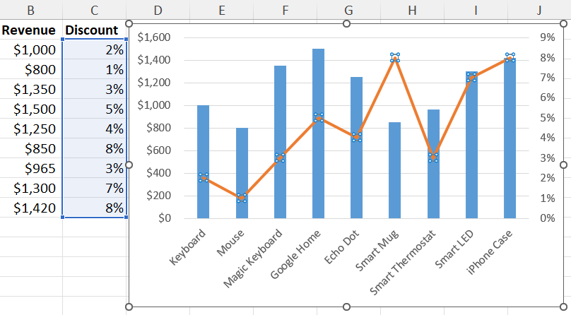
For example, the above dataset is the perfect candidate for this exercise. Here, I want to draw a relationship between revenue generation and discounts on products sold. This will allow me to increase the discounts if it helps in sales or reduce those if there’s no correlation between revenue and discounts.
If you’ve already organized your input dataset as shown in the above example, you’re ready to get started.

Highlight the dataset and click on the Recommended Charts button inside the Charts block of the Insert tab.
You shall see the Insert Chart dialog. By default, Excel selects the Recommended Charts tab.

The second chart type should be the perfect option that automatically converts the data series of lower values as the secondary axes of the chart.
Select that chart and hit the OK button to include the visualization in your worksheet.

In the above Excel chart, the X axis is common for the first and second Y axes. The values in the Revenue column are displayed in the column chart and the percentages in the Discount column are plotted as a line chart.
You can add Axis Titles and Data Labels as chart modifications to help your audience easily distinguish two Y axes.
📒 Read More: 7 Ways to Add Chart Axis Labels in Microsoft Excel
Use Combo to Add a Secondary Axis in Excel
The Combo chart allows you to manually assign the Secondary Axis attribute to any of the Y axes to visualize more than one vertical axis in Excel.

Select your dataset and add any chart you like from the Insert > Charts command block. It’s better to add either the column or the line chart objects.
It doesn’t matter whether you see the second data series in the chart after adding a basic graph at this stage.

Click on the chart you’ve added and go to the Chart Design tab on the Excel ribbon menu.
There, select the Change Chart Type button inside the Type block.

This should open the Change Chart Type dialog. Here, navigate to the All Charts tab and select the Combo chart object from the left-side navigation panel.
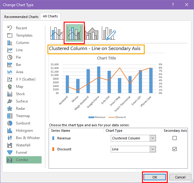
Now, you can click the Clustered Column – Line on Secondary Axis chart template to modify the column chart to a Combo chart.
This option assigns the column containing higher values to the left side vertical axis and the rest to the right side vertical axis.

If you wish to select the left and right side vertical axes yourself, choose Clustered Column – Line chart style.
Go to the bottom of the dialog box to make the following selections:
- Chart Type: Choose two different chart types by clicking this drop-down for either data series name.
- Secondary Axis: Checkmark the checkbox for the data series that you want to make the right-side vertical axis or secondary Y axis.
Adding a Secondary Axis Manually in Excel
If there’s already an Excel chart, you can reconfigure the chart object to add a secondary vertical axis easily.

Suppose, you wish to plot the values in columns Revenue and Discount on the primary X axis, the Item column.
Since the Item and Revenue columns are already inside the chart, you simply need to add the Discount column.

To achieve this, right-click the chart object and choose the Select Data option from the context menu.

You shall now see the Select Data Source dialog box. Click the Add button below the Legend Entries (Series) column.

Type a name inside the Series name field of the Edit Series dialog. Click on the up arrow of the Series values field and highlight the values of the Discount column. Ensure you don’t highlight the column header text.
If you accomplish the above steps accurately, you shall see the values of the new column in the chart object.

However, due to the huge difference between the values of the Revenue and Discount columns, the Discount data series is barely visible on the chart.

to fix this, follow the steps mentioned in the Combo chart section above to introduce a Line chart type to the secondary axis you’ve just added.
Use Series Options to Add a Secondary Axis in Excel
Another effortless method to add a secondary axis in Excel is the Series Options menu of Format Data Series.

Let’s find below how you can appropriately plot the secondary data series (Discount column) and axis in the above chart using Series Options.
The values of the Discount column are already in the chart. But, these aren’t visible due to the scale gap with the data of the Revenue column.

To visualize the Discount data series, click any of the visible columns to bring up the Format Data Series on the right.

Click the Series Options drop-down and choose the Series “Discount” option from the context menu.

Now, click on the Series Options icon just below the drop-down and select the Secondary Axis radial button to visualize both the Revenue and Discount data series on the existing chart object.

You should see a stacked column chart with two data series. On the right, you should also see the secondary axis relevant to the values in the Discount column.
If the stacked column chart isn’t suitable for you, reconfigure the chart to Combo by following the steps mentioned earlier in this article.
Adding a Secondary X Axis in Excel
So far, you’ve learned different methods to add a secondary vertical or Y axis in Excel. However, if needed, you can also plot two-column data values on a chart with an upper and lower X-axis data series.
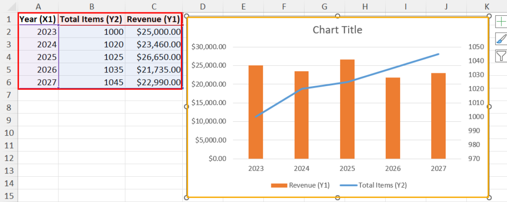
Suppose, you’ve created a column (Revenue column) and line chart (Total Items column) using the above dataset against the common horizontal axis Year.

Now, you also want to add the Month column data as the upper horizontal axis.

To insert the data series from Month, click on any white space of the chart object. Then, click the plus (+) sign in the top right corner of the chart to expand the Chart Elements menu.

Hover the cursor over the Axes option on the context menu to bring up an arrow. Click on the arrow to open the overflow context menu.
There, click on the Secondary Horizontal option.

Excel shall replicate the primary horizontal axis as the secondary horizontal axis.

Now, click on the secondary horizontal axis to highlight the year values. Right-click and choose Select Data from the context menu.

You should see the Select Data Source dialog. Click on the Edit button below the Horizontal (Category) Axis Labels column.

The Axis Labels dialog shall pop up. Use the arrow icon on this dialog to select the cells below the Month column.

Click OK to update the Horizontal Axis Labels data series.

Select OK again on the Select Data Source dialog to add Month values as the secondary X axis in Excel.
Use Excel VBA to Add a Secondary Axis in Excel
Excel VBA programming allows you to automate various repetitive and time-consuming tasks in Excel. If you’d like to automatically add a secondary axis with minimal actions taken from your end, you must try this method.
Firstly, you need to create a VBA macro using the following VBA script:

Sub AddSecondaryAxis()

    ' Declare variables
    Dim ChartName As String
    Dim DataRange As Range

    ' Get the chart name from the user
    ChartName = InputBox("Enter the name of the chart")

    ' Check if the chart exists in the ActiveSheet
    If Not ChartExists(ChartName) Then
        MsgBox "The specified chart does not exist in the active sheet."
        Exit Sub
    End If

    ' Get the data range for the secondary Y axis from the user
    On Error Resume Next
    Set DataRange = Application.InputBox("Select the data range for the secondary Y axis", Type:=8)
    On Error GoTo 0

    ' Check if a range was selected
    If DataRange Is Nothing Then
        MsgBox "No data range was selected."
        Exit Sub
    End If

    ' Add the secondary Y axis to the chart
    With ActiveSheet.ChartObjects(ChartName).Chart
        .SeriesCollection.NewSeries
        .SeriesCollection(.SeriesCollection.Count).Values = DataRange
        .SeriesCollection(.SeriesCollection.Count).AxisGroup = 2
        .SeriesCollection(.SeriesCollection.Count).ChartType = xlLine ' Add this line
    End With

    MsgBox "Secondary Y axis added successfully."

End Sub

' Function to check if a chart exists in the ActiveSheet
Function ChartExists(ChartName As String) As Boolean
    Dim cht As ChartObject
    ChartExists = False
    For Each cht In ActiveSheet.ChartObjects
        If cht.Name = ChartName Then
            ChartExists = True
            Exit Function
        End If
    Next cht
End Function
You don’t need to customize any part of the above script. I’ve ensured that there aren’t any hard-coded cell or function references in the VBA code.
If you’re about to set up a VBA macro for the first time, refer to this article:
📒 Read More: How To Use The VBA Code You Find Online

If you’ve successfully created the VBA macro, you can run it by pressing Alt + F8 keys, selecting the AddSecondaryAxis macro, and hitting the Run button on the Macro dialog.

When the macro runs, it shows an input box so you can enter the name of the target chart on the active worksheet.

Then, you can use the mouse cursor to select the input dataset.

Finally, Microsoft Excel modifies the existing chart to include the secondary Y axis you’ve been looking for.
How to Remove a Secondary Axis in Excel (Bonus)
Removing a secondary axis in Excel is more straightforward than adding it.
Go to the target worksheet and find the chart object from which you want to remove an additional Y axis.
Click on the chart data series linked to the secondary axis.

Hit the Delete key on the keyboard.
Conclusions
These are the tried and tested methods to add a secondary axis in Microsoft Excel. You can use any technique that matches your Excel expertise level. However, my personal favorite is the Excel VBA-based method.
If the article helped you or you’d like to share another secret method to add a secondary axis, comment below.


 👉 Find out more about our Advanced Formulas course!


Hi,
Many thanks for such an incredibly detailed and helpful tutorial.
I have several months of blood pressure data and I am not sure if the 4 columns Time, Systolic, Diastolic, and Pulse can be shown on a graph.
I will experiment but it would be great if you could show me a screenshot of how such a graph would look.
Date Day Time Systolic Diastolic Pulse
06-Mar Wed 14:15 139 85 67
10-Mar Sun 15:30 157 94 60
11-Mar Mon 12:45 135 90 73
12-Mar Tue 10:15 169 99 56
12-Mar Tue 16:40 141 93 67
14-Mar Thu 10:30 139 78 63
Thanks again and also for the VBA script which I will experiment with.